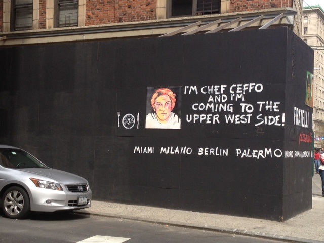
Here’s a great example of a personal and professional pitch on the corner of 76th St. and Broadway on the Upper West Side of NYC. This is so creative because they used their own building façade to showcase it. What would normally be a wall of blank plywood, has been transformed into a black backdrop for a colorful Warhol-esque image of the chef and his pitch which which reads: I’m Chef Ceffo and I’m coming to the Upper West Side.

Then, it lists their other locations, Miami, Milano, Berlin and Palermo
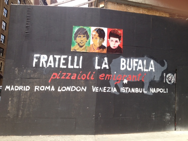
The story continues on the front of the building reading: Fratelli La Bufala Pizzaioli Emigranti and then then still more locations: Madrid, Roma, London, Venezia, Istanbul and Napoli.) It now occurs to me that this is a worldwide chain of restaurants and I think this personalized pitch is especially clever, given that fact.

There are 3 images of young men on the front of the Fratelli La Bufala sign. Are these photos of the chef through the years? Chefs of other locations? It is unclear.
Here’s a link to an older version of the sign—that seems to be a variation on this same theme, but based on this photo alone, doesn’t seem to have the same artsy flair as the newer one.
http://ny.eater.com/archives/2012/01/plywood_171.php#plywood-5
And here’s the Fratelli La Bufala website: http://www.fratellilabufala.eu/
As cool as you would expect from a place that puts this kind of thought into their branding.
Would this type of personalized pitch make you more likely to check out this restaurant once it is opens?
